
Subtotal ₨ 0
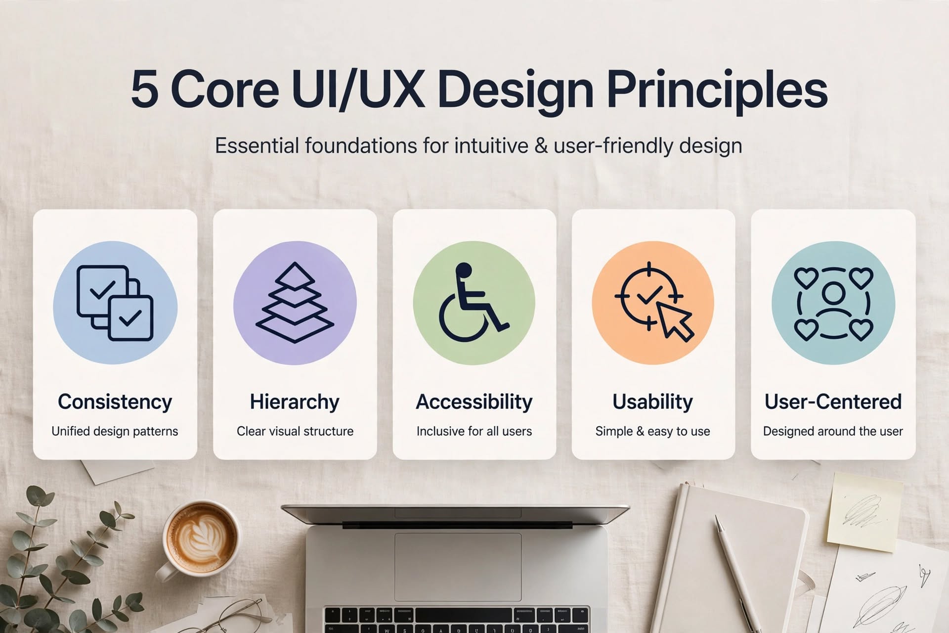
Great products don’t happen by accident. They follow proven rules. Understanding the principles of UI UX design is what separates beginner designers from professionals whose projects actually convert. These principles are not just theory. They are psychology-backed rules that guide users to take action effortlessly. In this guide, you will learn 7 must-know principles that will instantly elevate your projects.
What Are The Core Principles of UI UX Design and Why They Matter?
The principles of UI UX design are fundamental laws for creating intuitive, user-friendly, and delightful digital products. They ensure your design is not only beautiful but also functional. Without them, even the most visually stunning app can feel confusing and frustrating.
When you apply these principles correctly, you reduce cognitive load, build trust, and guide users naturally toward their goals. This directly boosts conversions, retention, and customer satisfaction. Every successful product from Apple to Airbnb follows these same principles.
7 Must-Know Principles of UI UX Design To Elevate Your Projects
Principle 1: Consistency – The Foundation of Trust
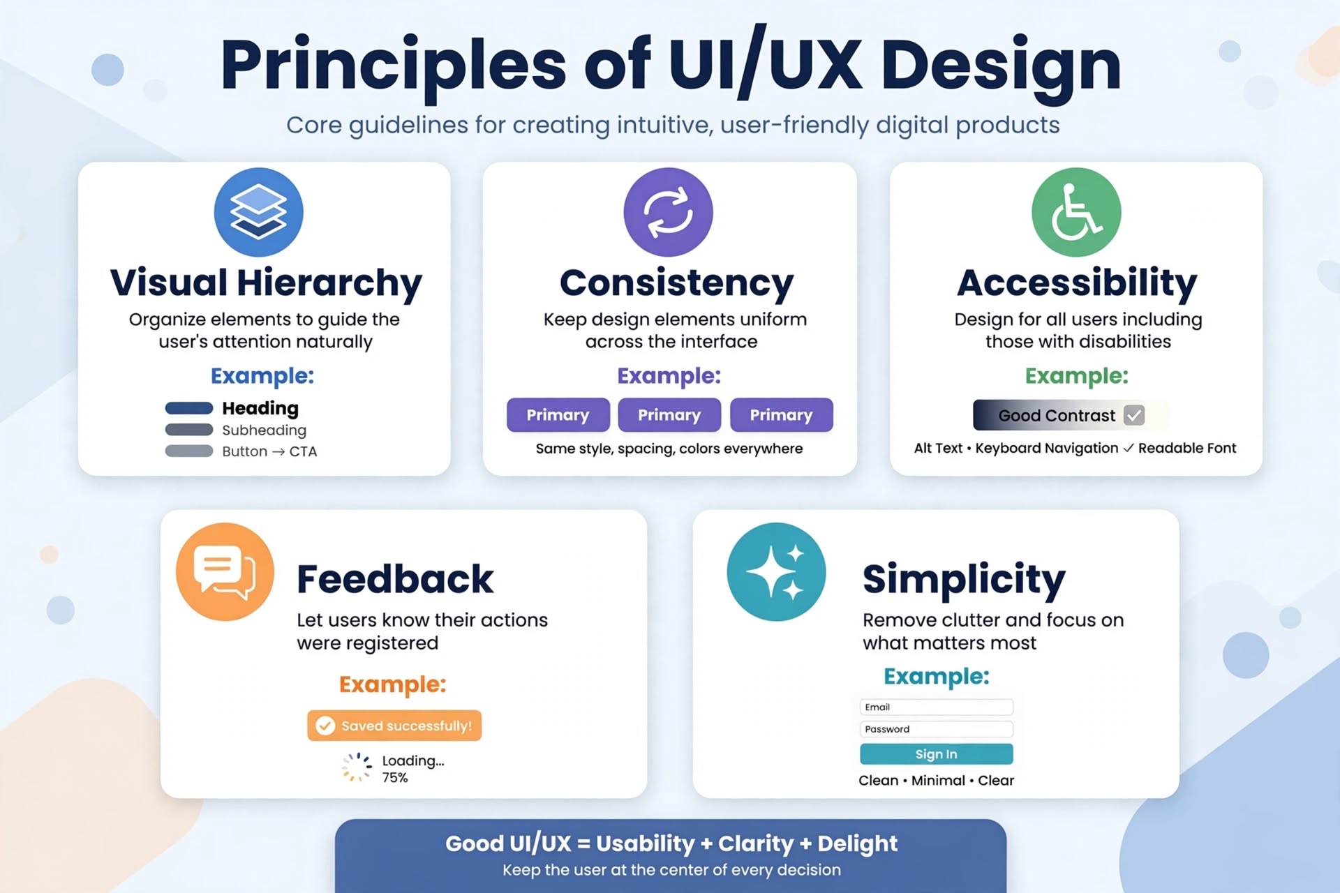
Consistency means similar elements should look and behave similarly throughout your product. Buttons should have the same style, colors should have the same meaning, and navigation should be in the same place on every page.
When you are inconsistent, users have to relearn how your interface works on every screen. This creates friction. Keep your design system consistent to build familiarity and trust. This is the most basic of all principles of UI UX design.
Principle 2: Visual Hierarchy – Guide The User’s Eye
Visual hierarchy is about arranging elements to show their order of importance. Use size, color, contrast, and spacing to guide users’ attention to the most important action first.
For example, your primary CTA button should be larger, bolder, and have higher contrast than secondary buttons. Headings should be bigger than body text. Good hierarchy makes scanning effortless. Users should understand what to do in 3 seconds without thinking.
Principle 3: User-Centricity – Design For The User, Not For Yourself
Always put the user at the center. This principle reminds us that we are not the user. Every design decision should be based on real user needs, behaviors, and pain points, not personal preferences.
Conduct user research, create personas, and validate your ideas with testing. When you design for your actual users, you create products that solve real problems. This is the heart of all principles of UI UX design.
Principle 4: Accessibility – Design For Everyone
Great design is inclusive. Accessibility means designing for people with diverse abilities, including visual, hearing, motor, or cognitive impairments. This includes sufficient color contrast, readable fonts, keyboard navigation, and proper alt text.
Accessible design benefits everyone, not just people with disabilities. High contrast helps users in bright sunlight. Clear language helps non-native speakers. Designing accessibly expands your audience and is ethically right.
Principle 5: Simplicity – Less Is More
Simplicity means removing unnecessary elements and focusing on what matters most. Every extra button, image, or line of text adds cognitive load. Ask yourself, “Can I remove this without harming the user goal?”
The best interfaces feel effortless because they hide complexity. Use white space generously. Break complex tasks into simple steps. Simplicity is not about making things look minimal. It is about making them easy to understand.
Principle 6: Feedback and Affordance – Show What Happens Next
Users need to know if their action was successful. Feedback is the system’s response to user action. A button changing color when clicked, a “Saved successfully!” message, or a loading spinner are all feedback.
Affordance means making it obvious how an element should be used. A button should look clickable. A link should look like a link. Without feedback and affordance, users feel lost and anxious.
Principle 7: Usability – Make It Effortless to Use
Usability ties all principles together. Your product should be efficient, easy to learn, and pleasant to use. Follow Jakob Nielsen’s heuristics: prevent errors, allow undo, and keep users in control.
Test your design with 5 real users. If they struggle, your usability needs work. No matter how beautiful your UI is, if it is not usable, it will fail.
How to Apply Principles of UI UX Design in Your Next Project
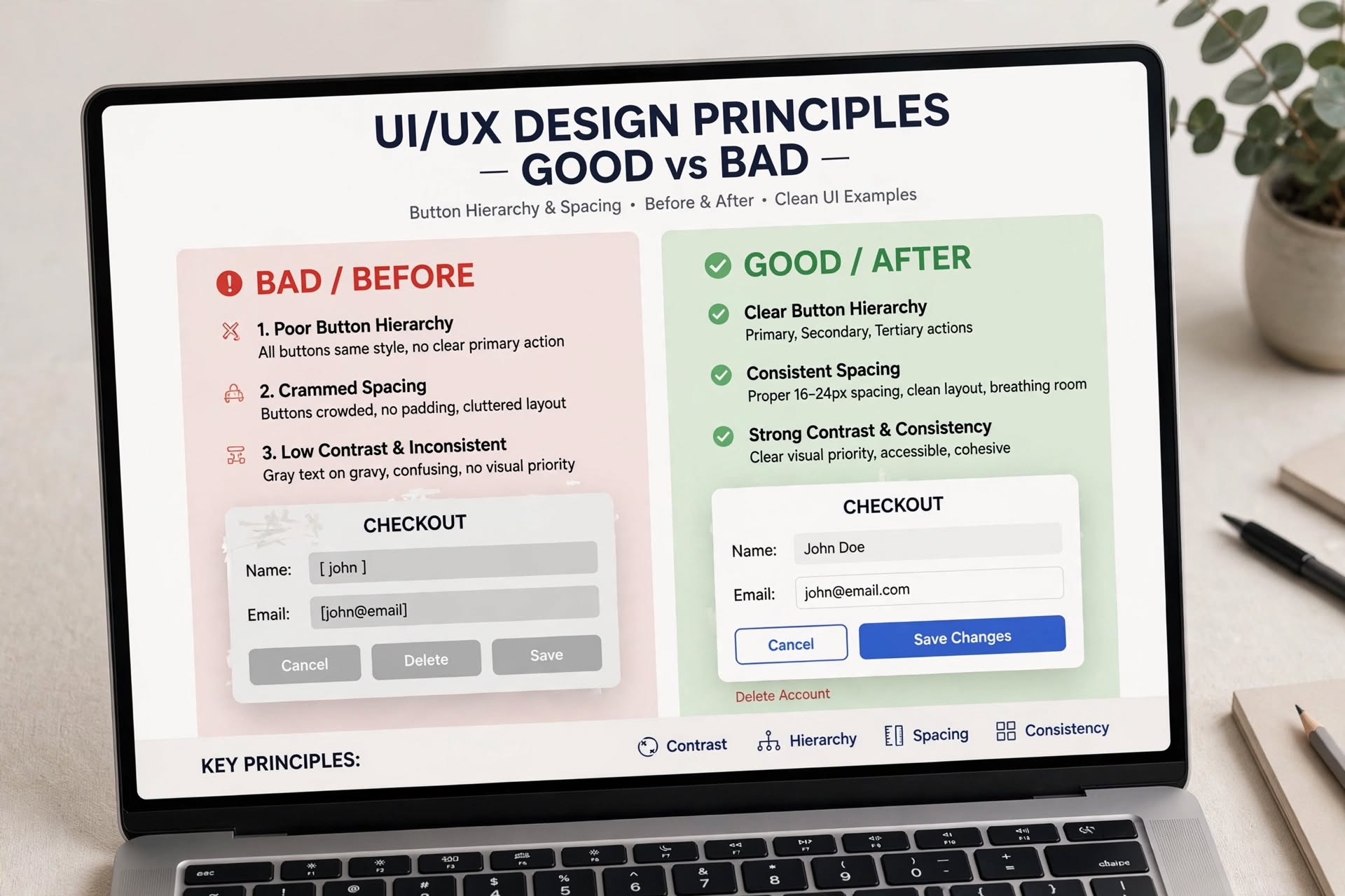
Start with an audit. Take your current project and check it against these 7 principles. Is your hierarchy clear? Is your design consistent? Is it accessible?
Create a simple checklist and use it before every design review. Use Figma’s accessibility plugins to check contrast. Use a design system to enforce consistency. Small improvements in these principles compound into massive project elevation.
Conclusion
Mastering the principles of UI UX design is not about memorizing rules. It is about building a mindset of empathy, clarity, and purpose. These 7 principles will help you create projects that not only look amazing but also perform amazingly.
Apply them today and watch your projects transform from good to exceptional.
Ready to elevate your next project with expert UI/UX?