
Subtotal ₨ 0
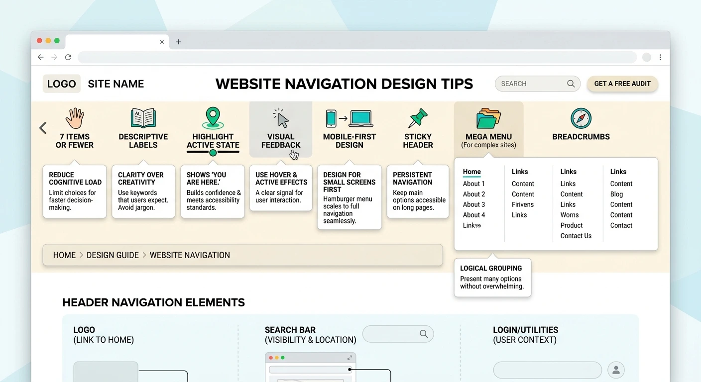
These website navigation design tips will help visitors find what they need within seconds, which is exactly what keeps them on your site. Navigation is the map of your website. When it is clear, people explore, trust you, and take action. When it is confusing, they leave. This guide explains what website navigation is, the main types, and 9 proven rules you can apply today.
Table of Contents
- What Is Website Navigation?
- Why Website Navigation Design Tips Matter
- Types of Website Navigation
- 9 Website Navigation Design Tips
- Mobile Navigation Design
- How to Test Your Navigation
- Common Navigation Mistakes
- How Navigation Connects to Your Content
- Final Thoughts
- Frequently Asked Questions
What Is Website Navigation?
Website navigation is the system of menus, links, and buttons that helps visitors move around your site. It includes your main header menu, footer links, breadcrumbs, and any search bar. Good navigation answers three questions fast: where am I, where can I go, and how do I get there?
Why Website Navigation Design Tips Matter
Strong navigation affects almost every part of site performance. Following solid website navigation design tips gives you real advantages:
- Better user experience: visitors find information without frustration
- Higher conversions: clear paths lead people to your contact and service pages
- Stronger SEO: search engines use your links to discover and understand your pages
- Lower bounce rate: people stay longer when the next step is obvious
Google also recommends a clear site structure, as explained in its SEO Starter Guide.
Types of Website Navigation
Before applying any website navigation design tips, know which navigation types you are working with:
| Type | What It Does | Best For |
|---|---|---|
| Header menu | Main links at the top of every page | All websites |
| Sticky menu | Stays visible while visitors scroll | Long pages and landing pages |
| Footer navigation | Secondary links at the bottom | Policies, contact details, extra pages |
| Breadcrumbs | Shows the path back to higher-level pages | Large sites and online stores |
| Hamburger menu | Collapses links behind an icon | Mobile screens |
| Search bar | Lets visitors type what they want | Sites with lots of content |
9 Website Navigation Design Tips
Apply these website navigation design tips in order, starting with the menu structure and finishing with the details.
1. Keep the Main Menu Simple
Aim for five to seven top-level links. Too many choices overwhelm visitors. This is one of the most important website navigation design tips because simple menus are easier to scan and remember.
2. Use Clear, Familiar Labels
Choose plain words like Services, About, and Contact. Avoid clever names that make people guess what a page contains.
3. Put Important Pages First
Visitors notice the first and last menu items most. Place your key service pages near the start, and put your contact button at the end.
4. Follow a Logical Hierarchy
Group related pages under one parent menu item. A clear structure, from broad categories to specific pages, helps both visitors and search engines understand your site.
5. Make Navigation Consistent
Keep the menu in the same place with the same labels on every page. Consistency builds confidence, and visitors never have to relearn how your site works.
6. Add Breadcrumbs on Larger Sites
Breadcrumbs show visitors exactly where they are and give them an easy way back. They also add helpful internal links for SEO.
7. Highlight the Current Page
Use a different color or underline for the active menu item. This small detail answers the “where am I?” question instantly.
8. Include a Visible Call to Action
Style one menu item, such as Get a Quote, as a button. It guides ready-to-buy visitors straight to the next step.
9. Add Search for Content-Heavy Sites
If your site has many pages, products, or articles, a search bar saves time. Place it in the header where people expect to find it.
Mobile Navigation Design
Most visitors browse on phones, so mobile navigation design deserves its own attention. Many website navigation design tips apply on small screens too, but a few change. Use a hamburger menu with a clear icon, make tap targets at least 44 pixels tall, and keep spacing generous so thumbs do not hit the wrong link. Keep the most important actions, like call or contact, easy to reach without opening the full menu.
How to Test Your Navigation
Even the best website navigation design tips need proof. Do not guess whether your menu works. Test it with real people:
- Ask a friend to find a specific page without any help
- Watch where they hesitate or click the wrong link
- Review heatmaps and click data to see which menu items get used
- Check your analytics for pages with high exit rates
- Test on both desktop and mobile devices
Common Navigation Mistakes
Even when you follow website navigation design tips closely, these problems can quietly push visitors away:
- Too many menu items competing for attention
- Vague labels such as Solutions or Resources with no clear meaning
- Dropdown menus that disappear when the mouse moves slightly
- Hidden or tiny mobile menu icons
- Broken links and dead-end pages with no next step
- Different menus on different pages
How Navigation Connects to Your Content
Navigation works best when it matches your content plan. Each menu item should lead to a page with a clear purpose, and each page should link to related pages so visitors always have a next step. Review your menu whenever you add a new service or section, so the structure grows with your business instead of becoming cluttered over time.
Final Thoughts
The best website navigation design tips share one idea: make it effortless for visitors to find what they came for. Keep menus short, labels clear, and structure logical, then test with real users and refine over time. A well-planned menu quietly improves user experience, SEO, and conversions all at once.
At System Software Development Solution (SSD Sol), our team in Lahore plans navigation as part of every project. Explore our website design and development services, learn more about us, or read our guide on top web development trends. Want a site that is easy to navigate? Contact us for a free consultation.
Frequently Asked Questions
What are the best website navigation design tips?
Keep your main menu to five to seven items, use clear labels, follow a logical hierarchy, stay consistent across pages, and design a simple mobile menu.
How many items should a navigation menu have?
Five to seven top-level items works well for most sites. Use dropdowns or sub-pages to organize anything beyond that.
Does website navigation affect SEO?
Yes. Search engines follow your links to discover pages, so a clear structure helps them crawl and understand your content, while visitors stay longer on an easy-to-use site.
What is the best navigation for mobile websites?
A hamburger menu with large tap targets and a visible call to action is the most common and effective choice for mobile screens.