
Subtotal ₨ 0
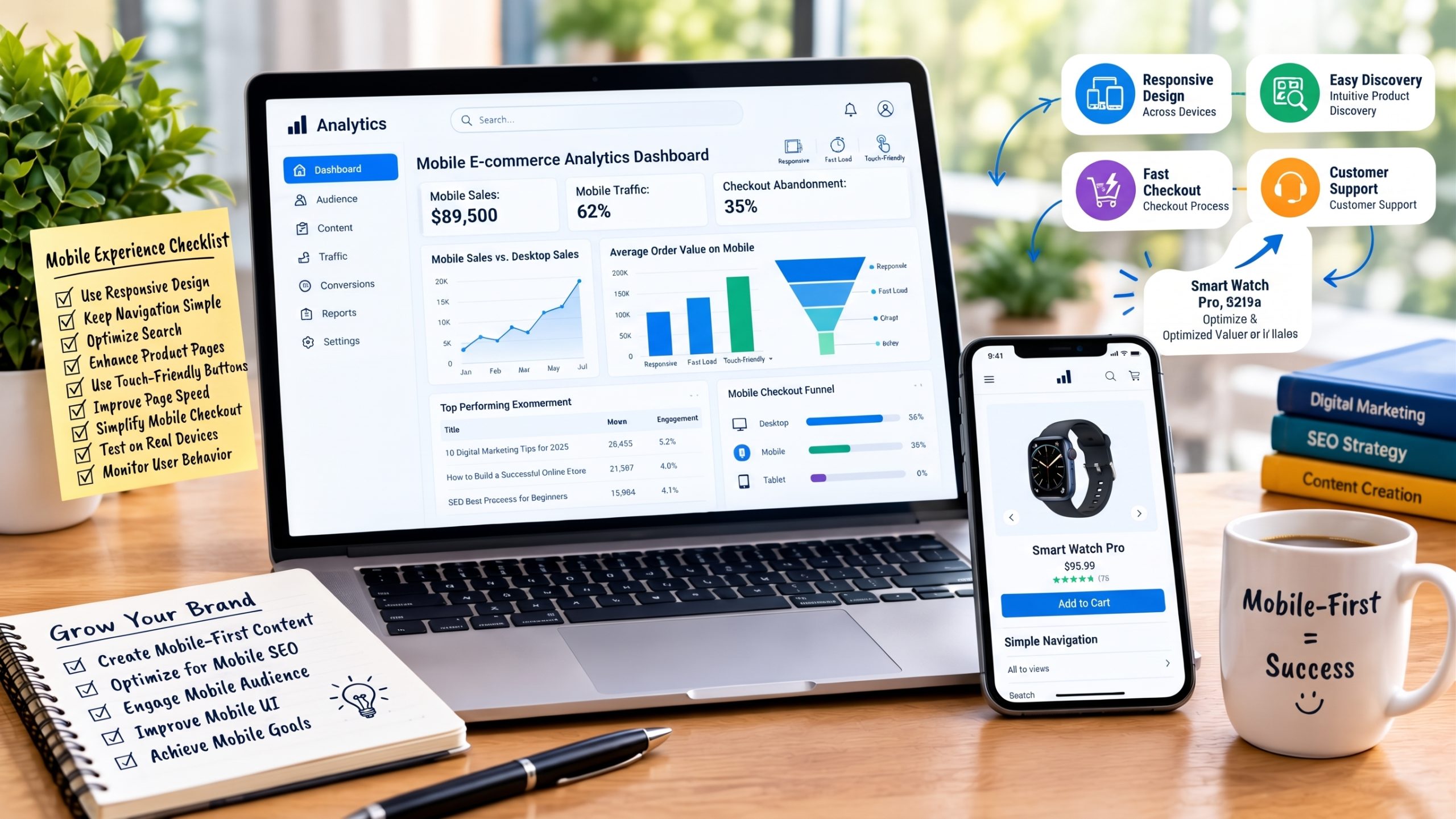
Smartphones have changed the way people browse products, compare prices, communicate with businesses, and make purchases online.
For e-commerce businesses, mobile shopping experience design is therefore an important part of website development.
A mobile-friendly store should not simply shrink a desktop website. It should provide an experience designed around smaller screens and touch-based interaction.
What Is Mobile Shopping Experience Design?
Mobile shopping experience design focuses on making the online shopping journey easy and convenient on smartphones and other mobile devices.
It includes:
- Navigation
- Product discovery
- Product pages
- Search
- Forms
- Checkout
- Payments
- Performance
1. Use Responsive Design
Your website should adapt to different screen sizes.
Elements such as:
- Images
- Text
- Buttons
- Menus
- Product grids
- Forms
should adjust appropriately for mobile devices.
2. Keep Navigation Simple
Mobile screens have limited space.
Use simple menus that allow customers to quickly access:
- Categories
- Search
- Cart
- Account
- Important pages
Avoid overwhelming users with too many navigation options.
3. Make Search Easy
Customers should be able to quickly find products.
Consider:
- Search suggestions
- Filters
- Product categories
- Spelling tolerance
- Relevant search results
4. Optimize Product Pages
Mobile product pages should prioritize important information.
Customers should be able to easily see:
- Product image
- Name
- Price
- Availability
- Key features
- Purchase button
Additional information can be available below.
5. Make Buttons Touch-Friendly
Small buttons can be difficult to tap.
Use appropriately sized interactive elements and provide enough spacing between controls.
6. Improve Mobile Page Speed
Mobile users may have slower connections than desktop users.
Optimize:
- Images
- Scripts
- Fonts
- Page assets
- Server response
- Third-party tools
Technical optimization can improve the overall shopping experience.
Businesses that need professional web development solutions can work with developers to identify and resolve performance and usability issues.
7. Simplify Mobile Checkout
Mobile checkout should be particularly simple.
Use:
- Short forms
- Autofill where appropriate
- Clear labels
- Large buttons
- Convenient payment methods
Avoid unnecessary steps.
8. Make Product Images Mobile-Friendly
Product images should look good without taking excessive screen space or slowing down the page.
Use optimized images with appropriate dimensions.
9. Make Customer Support Accessible
Customers may need help while shopping.
Make support options easy to find, such as:
- Contact forms
- Phone
- Live chat
- Help centers
10. Test on Real Devices
Do not rely only on a desktop browser’s responsive preview.
Test your website on different:
- Android devices
- iPhones
- Screen sizes
- Browsers
- Connection speeds
11. Monitor User Behavior
Analytics can help identify where mobile users experience difficulties.
Review:
- Mobile conversion rates
- Product engagement
- Checkout abandonment
- Page speed
- Search behavior
Use this information to prioritize improvements.
Conclusion
Mobile shopping experience design is now an important part of building an effective e-commerce website.
Focus on responsive design, simple navigation, fast loading, easy product discovery, touch-friendly controls, and a streamlined mobile checkout.
A well-planned mobile experience can make online shopping easier and more accessible for customers.
If you need help developing or improving your e-commerce website, explore SSD Solutions for web and software development services.
FAQs
What is mobile shopping experience design?
It is the process of designing an online shopping journey specifically for mobile users.
Why is mobile e-commerce important?
Customers increasingly use mobile devices to browse and shop online, so businesses need websites that work effectively on smaller screens.
How can I improve my mobile store?
Start with responsive design, fast performance, simple navigation, optimized product pages, and an easy checkout process.
Should I build an app instead of a mobile website?
It depends on your business model and customer behavior. A responsive website may be sufficient for some businesses, while others may benefit from a dedicated mobile application.