
Subtotal ₨ 0
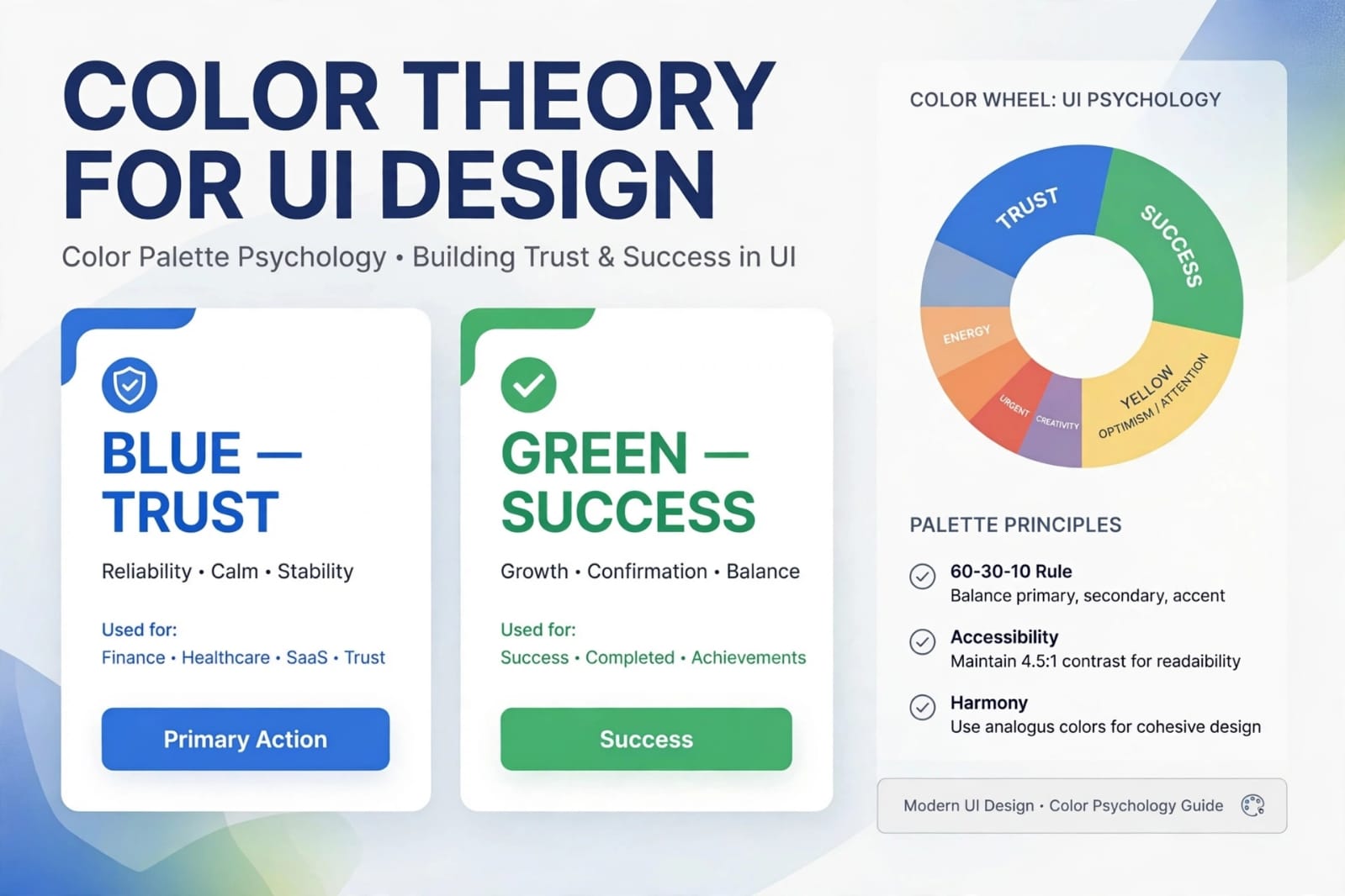
Introduction: Color is Not Just Decoration
Color theory for UI design is one of the most powerful tools to influence user behavior. If you want to grow your business, you cannot ignore colors.
Many founders think color is just about making things look pretty. In reality, color decides whether a user trusts you, clicks your button, or leaves your site.
At SSDSOL, we use proven color psychology to help businesses boost conversions and build a memorable brand.
What is Color Theory for UI Design?
Color theory for UI design is the science and art of using color strategically in digital interfaces. It includes color wheel, color theory principles,color harmony, contrast, and psychology.
Good color theory ensures your design is not only beautiful but also functional and accessible. It guides users, creates hierarchy, and evokes the right emotions.
Why Color Theory for UI Design Matters for Your Business?
1. Colors Drive Conversions
Did you know changing a button color from blue to orange can increase conversions by 32%? This is color psychology in action.
Red creates urgency, perfect for sale buttons. Green signals success and growth. Blue builds trust for banking and SaaS products. Choosing the right color directly impacts your revenue.
2. Colors Build Brand Trust and Recognition
Color increases brand recognition by up to 80%. Think of Facebook’s blue, Starbucks’ green, or Coca-Cola’s red.
When you consistently use color theory for UI design, users instantly recognize and trust your brand. Consistency in color equals trust.
3.Colors Improve Usability and Accessibility
Color theory for UI design is critical for usability. Sufficient contrast makes text readable.
If your contrast is poor, 1 in 12 men and 1 in 200 women with color blindness cannot use your product. Following WCAG 4.5:1 contrast ratio is not optional, it is essential for business.
The 60-30-10 Rule: The Secret Formula
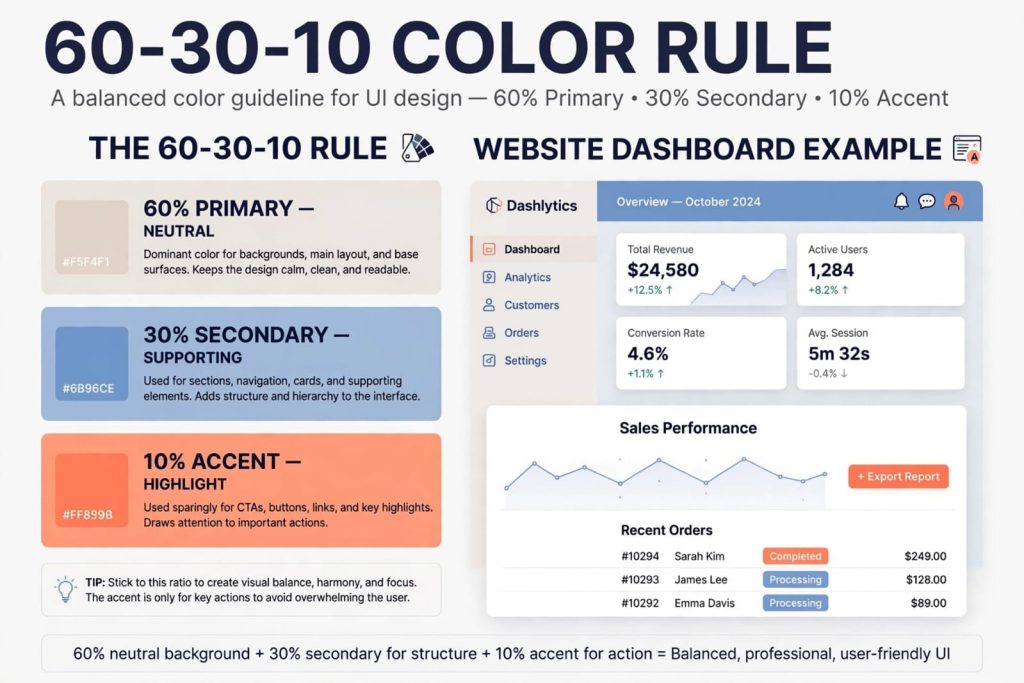
The most famous rule in color theory for UI design is the 60-30-10 rule. It creates perfect balance.https://ssdsol.com/blog/must-know-principles-ui-ux-design-elevate-projects/
60% is your dominant neutral color (white, light gray, beige) for backgrounds. 30% is your secondary color for sections and navigation. 10% is your accent color for CTAs and important actions.
This rule prevents your UI from looking chaotic and helps users focus on what matters most.
Color Psychology in UI: What Each Color Means
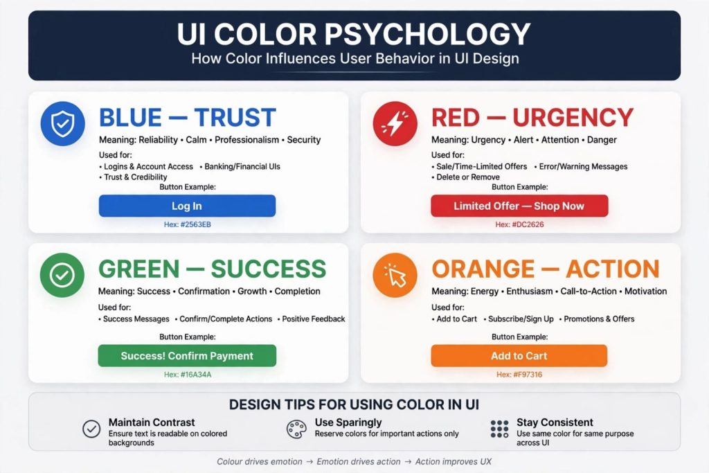
Blue – The Color of Trust
Blue is the most used color in UI design. It means trust, security, and professionalism. Perfect for finance, healthcare, and SaaS businesses.
Red – The Color of Urgency
Red grabs attention instantly. Use it for errors, warnings, and limited-time offers. But use it sparingly, too much red creates anxiety.
Green – The Color of Success
Green means success, growth, and confirmation. Ideal for success messages, confirm buttons, and eco-friendly brands.
Orange – The Color of Action
Orange is energetic and friendly. It is one of the best colors for Call-to-Action buttons like “Add to Cart” or “Sign Up”.
Common Color Mistakes That Hurt Your Business
Avoid using too many colors. Stick to 1 primary, 1 secondary, and 1 accent color. More than that confuses users.
Never use color alone to convey information. Always add an icon or text. And never ignore color accessibility. Your business loses customers if they cannot read your content.
Conclusion: Use Color Theory to Grow Your Business
Mastering color theory for UI design is not just for designers. It is a business growth strategy. The right colors build trust, guide users, and drive action.
At SSDSOL, we don’t just pick beautiful colors. We pick colors that convert.
Ready to choose the right color palette for your business? Contact SSDSOL today for a free UI color audit.