
Subtotal ₨ 0

Accessibility in UX design ensures that digital products are usable by everyone, including people with disabilities. Following best practices for accessibility in UX design improves usability, expands your audience, and builds trust.
Why Accessibility Matters in UX Design
Accessibility is not optional — it’s essential. Inclusive design helps users with visual, auditory, motor, or cognitive challenges. Best practices for accessibility in UX design also align with legal standards like WCAG guidelines.
Core Best Practices for Accessibility in UX Design
Provide Text Alternatives
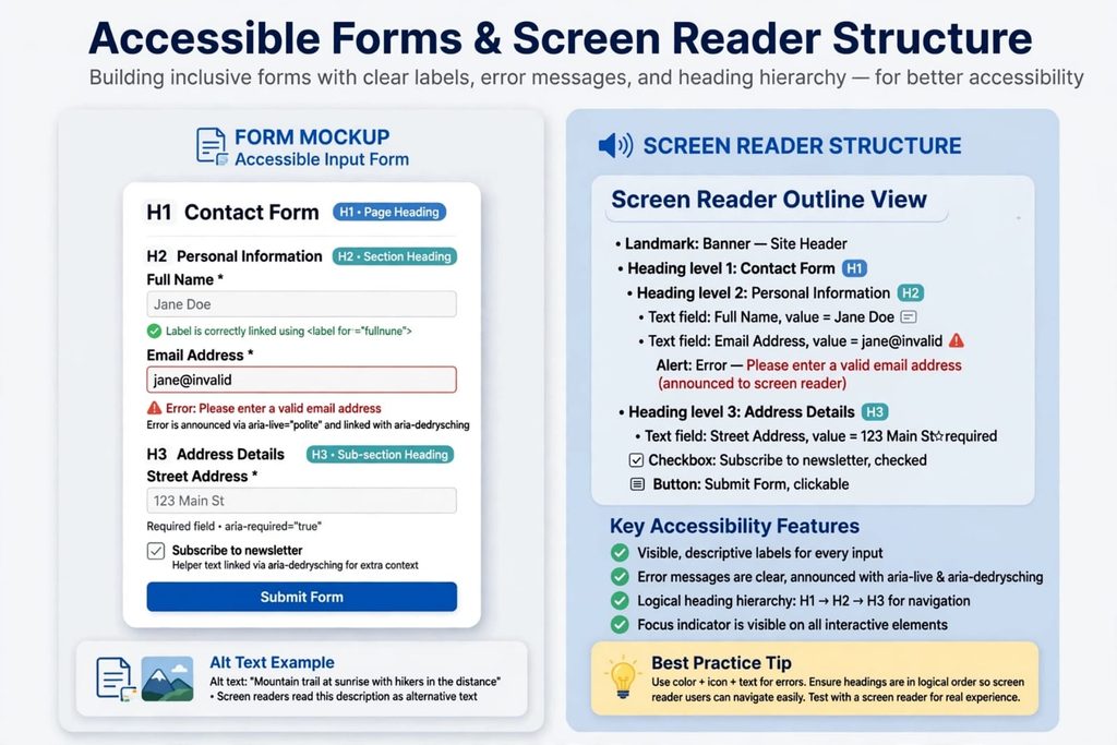
Images, icons, and media should include alt text. This ensures screen readers can describe content to visually impaired users.
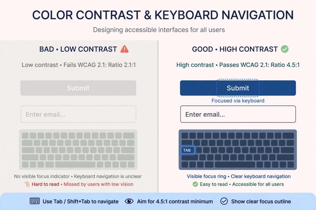
Ensure Color Contrast
Maintain a minimum contrast ratio of 4.5:1 for text. High contrast improves readability for users with low vision.
Use Clear and Consistent Navigation
Menus and buttons should be predictable. Consistency helps users with cognitive challenges navigate easily.
Support Keyboard Navigation
Not all users rely on a mouse. Ensure your app or site can be fully navigated using a keyboard.
Provide Captions and Transcripts
Videos should include captions. Audio content should have transcripts. This supports users with hearing impairments.
Benefits of Accessibility in UX Design
Accessibility improves usability for everyone, not just users with disabilities. Clear navigation, readable text, and strong contrast make apps easier to use. Businesses also benefit from wider reach and compliance with legal standards.
Following best practices for accessibility in UX design ensures your product is usable by everyone.
Common Accessibility Mistakes to Avoid
Missing Alt Text
Without alt text, screen readers cannot describe images, leaving users excluded.
Low Contrast Colors
Light gray text on white background is unreadable for many users. Always test contrast.
Complex Forms Without Labels
Forms must include clear labels. Placeholder text alone is not enough.
Ignoring Font Size
Tiny text reduces readability. Minimum body text size should be 16px.
Overusing Animations
Fast or flashing animations can trigger seizures or overwhelm users. Use animations carefully.
Ignoring Touch Targets
Buttons and interactive elements that are too small frustrate users, especially on mobile devices. Guidelines recommend a minimum touch target size of 44×44 pixels. Larger, well‑spaced buttons improve usability for everyone, including users with motor impairments.
Lack of Focus Indicators
When users navigate with a keyboard or assistive technology, focus indicators (like a visible outline around links or buttons) show where they are on the page. Removing or hiding these indicators makes navigation confusing. Always ensure focus states are clear and consistent.
Accessibility Testing in UX Design
Accessibility testing ensures compliance with WCAG standards. Use tools like WAVE or Axe to identify issues. Testing with real users who have disabilities provides valuable insights.
Tools to Check Accessibility
Designers can use tools like WAVE, Axe, and Lighthouse to test accessibility. These tools highlight issues such as missing alt text, poor contrast, or broken keyboard navigation. Regular testing ensures your design meets WCAG guidelines.
Real-World Example of Accessible UX
Consider a news app that added captions to all videos and improved font contrast. As a result, engagement increased by 25% among users with visual and hearing challenges. Accessibility directly impacts user satisfaction.
Conclusion — Apply Accessibility Best Practices Today
Accessibility is more than compliance — it’s about respect for all users. By applying best practices for accessibility in UX design, testing with tools, and learning from real examples, you create inclusive digital experiences..By applying best practices for accessibility in UX design, you create inclusive digital experiences
For expert guidance on accessibility, visit our contact page at SSD Solutions.