
Subtotal ₨ 0
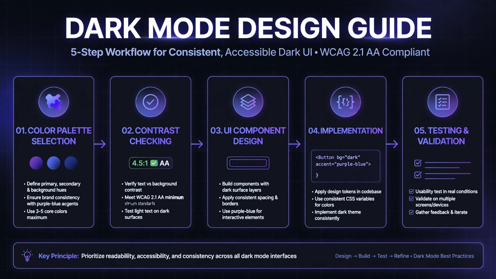
Dark mode is no longer just a trend, it is a user expectation. If you are looking for a complete dark mode design guide, you have come to the right place. From saving battery to reducing eye strain, dark mode offers powerful benefits, but only when designed correctly.
At SSDSOL, we implement dark mode in our UI/UX Design projects to create modern, stunning interfaces that users love. This dark mode design guide will teach you everything you need to know with 7 proven steps.
Why You Need a Dark Mode Design Guide?
Benefits
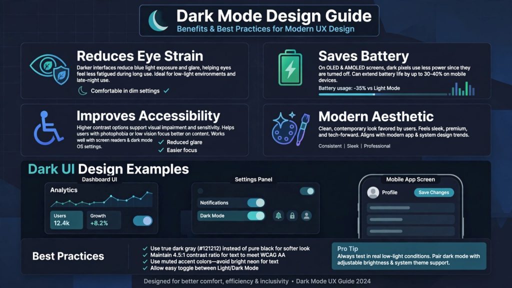
Understanding the why is the first part of any dark mode design guide. Dark mode is not just about inverting colors. Done right, it improves usability in many ways.
- Reduces Eye Strain: Dark interfaces reduce blue light exposure and glare, especially in low-light environments. Users spend hours at night on apps, and a proper dark mode design guide helps you design for comfort.
- Saves Battery: On OLED and AMOLED screens, black pixels are turned off. This can save up to 30-40% battery, a huge benefit for mobile users.
- Improves Accessibility: For users with photophobia or light sensitivity, dark mode is not a preference, it is a necessity. A good dark mode design guide must include accessibility standards.
- Creates Modern Aesthetic: Dark mode feels sleek, premium, and tech-forward. It helps your brand look stunning and contemporary.
Light Mode vs Dark Mode: What This Dark Mode Design Guide Recommends
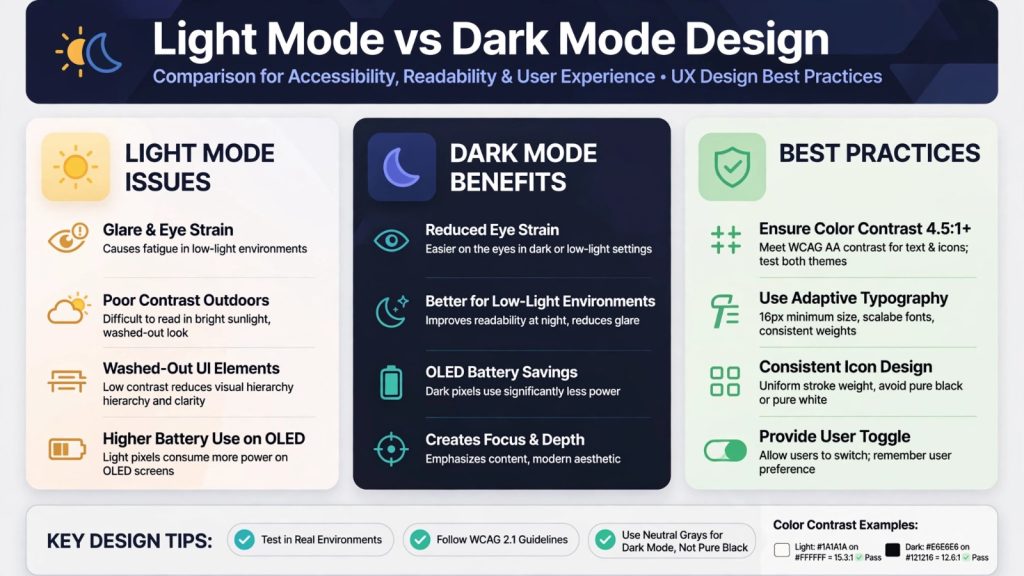
Many designers make the mistake of just inverting colors. This dark mode design guide comparison shows why that fails.
Light mode issues include glare in the dark, higher battery use on OLED, and washed-out hierarchy. Dark mode benefits include better focus, depth, and reduced eye strain at night.
The key lesson from this dark mode design guide is: never use pure black #000000 or pure white #FFFFFF. Use dark gray #121212 for background and off-white #E6E6E6 for text.
Learn more about our professional UI/UX Design services.
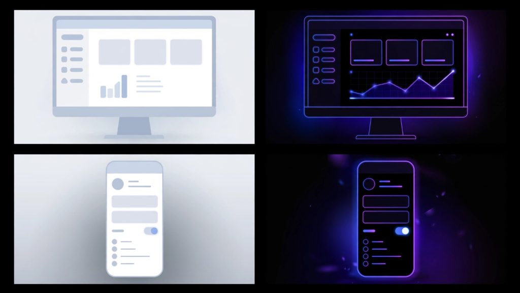
7 Proven Steps: The Complete Dark Mode Design Guide Workflow
Step 1: Choose Your Dark Palette Correctly
Don’t use pure black. Use #121212 as your base. This is a core rule in every professional dark mode design guide. It reduces eye strain and allows shadows to be visible.
Step 2: Maintain Contrast 4.5:1 Minimum
This is critical for accessibility. Your text must pass WCAG AA contrast. Use tools to check. A proper dark mode design guide always recommends testing both themes for contrast.
Step 3: Desaturate Your Brand Colors
Bright saturated colors vibrate on dark backgrounds and cause eye strain. In your dark mode design guide, lower the saturation of your primary colors by 20-30% for dark mode.
Step 4: Adapt Your Typography and Shadows
Use slightly lighter font weights in dark mode. Shadows don’t work on dark backgrounds, use subtle glows or lighter surfaces to create elevation. This is an essential tip in any modern material design dark mode design guide.
Step 5: Design Adaptive Icons and Images
Icons that work on light mode may disappear on dark mode. You need to create outlined or adaptive icons. For images, add a subtle border or dim them slightly. This dark mode design guide workflow ensures consistency.
Step 6: Provide an Easy Toggle and Remember Preference
Always let users choose. Provide a clear toggle in settings and remember their choice. Also respect system preferences. Our Web Development team implements this as standard.
Step 7: Test in Real Low-Light Conditions
The final step in this dark mode design guide is real-world testing. Test your design at night, outdoors, and with brightness at different levels. What looks good in Figma may cause stunning glare in real use.
Conclusion: Your Next Step
This complete dark mode design guide shows that dark mode is more than a color swap. It is a full UX decision that requires careful thought about color, contrast, typography, and user preference.
When you follow these 7 proven tips, you will create a stunning dark experience that saves battery, reduces eye strain, and makes your brand look powerful and modern.
Need help implementing dark mode? Contact System Software Development Solution for expert UI/UX solutions.