
Subtotal ₨ 0

Heuristic Evaluation Guide: Improve UX, Wireframes, and Website Accessibility
Is your website losing users despite having an attractive design? Hidden usability problems could be the reason. Heuristic evaluation helps UX designers identify these issues before they negatively affect user experience, customer satisfaction, and business performance.
By reviewing a website against established usability principles, businesses can discover confusing navigation, inconsistent layouts, and accessibility problems. Whether you’re designing a new interface or improving an existing product, this method provides a practical way to identify areas for improvement.
What Is Heuristic Evaluation?
Heuristic evaluation is a usability inspection method in which UX experts assess a website or application against recognized usability principles. Jakob Nielsen’s 10 usability heuristics are among the most widely used guidelines for this process.
These principles cover visibility of system status, consistency, error prevention, user control, and other important aspects of usability. Rather than relying entirely on user testing, designers can identify potential problems through expert inspection.
A structured evaluation helps teams prioritize improvements and create interfaces that are easier to understand and navigate.
7 Benefits of Heuristic Evaluation for Businesses
1. Identify Usability Problems Early
One major advantage of heuristic evaluation is its ability to reveal usability issues before launch. Designers can identify confusing menus, unclear buttons, and complicated user flows before they affect real customers.
2. Improve Wireframes and Prototypes
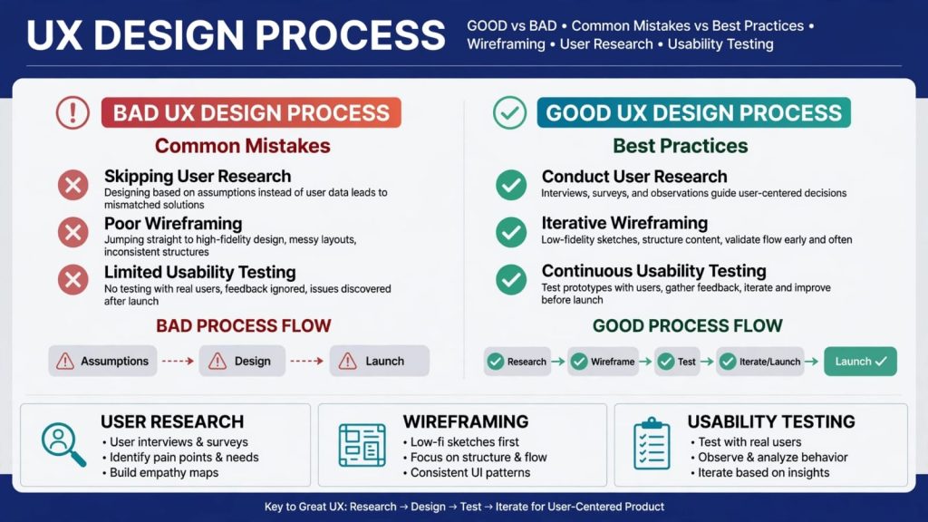
Usability reviews are valuable during the early design stages. When examining a wireframe, designers can check whether the layout and navigation make sense. Reviewing a prototype also helps reveal interaction problems before developers implement the final interface.
Fixing these issues early can reduce unnecessary revisions and development work.
3. Make Websites More Accessible
Website accessibility helps people with different abilities use digital products effectively. During an evaluation, designers can look for issues involving readable text, clear labels, understandable error messages, and consistent navigation.
However, heuristic evaluation alone cannot establish full accessibility compliance. Additional accessibility testing is necessary.
4. Improve the Figma Design Workflow
Figma allows designers to create interfaces, wireframes, and interactive prototypes. Applying usability principles while reviewing these designs can help teams identify inconsistencies before development begins.
Designers can review navigation patterns, button labels, form behavior, and feedback messages to make the interface more intuitive.
5. Reduce Development Rework
Finding usability issues during design is generally easier than correcting them after implementation. Evaluating layouts and interactions early helps teams avoid spending time rebuilding confusing interface elements.
It also gives developers clearer guidance about the expected user experience.
6. Build User Trust and Confidence
Users are more likely to trust a product when it behaves predictably. Clear instructions, consistent layouts, and helpful error messages make digital experiences easier to understand.
A usability review helps Web Developers identify elements that may confuse users or make a website feel unreliable.
7. Create a Clear Improvement Plan
A useful evaluation does more than list problems. It documents each issue, explains its impact, and recommends practical solutions.
Teams can prioritize critical usability problems first, then address smaller improvements based on their impact and available resources.
How to Conduct a Heuristic Evaluation
Follow these five steps to evaluate your website or application.
Step 1: Define Your Goals
Choose the pages, features, or user journeys you want to review. For example, you might evaluate a checkout process, registration form, or navigation menu.
Step 2: Review the Interface
Inspect the product against established usability principles. Review both the visual interface and interactive elements, including forms, buttons, and error messages.
Step 3: Examine Wireframes and Prototypes
Review your wireframing decisions and interactive prototypes to identify unclear layouts or confusing interactions. If you’re using Figma, inspect the relevant screens and prototype flows.
Step 4: Document and Prioritize Issues
Record each usability problem, explain why it matters, and assign a severity level. Prioritize issues that prevent users from completing important tasks.
Step 5: Implement and Validate Improvements
Make the recommended changes and review the updated design. Combine expert inspection with usability testing and appropriate accessibility checks to verify whether the improvements work as intended.
Conclusion
Heuristic evaluation is a practical way to identify usability problems and improve digital products before launch. From reviewing wireframes and prototypes to examining website accessibility and Figma designs, it helps teams make more informed design decisions.
At SSDSOL, applying usability principles throughout the UI/UX design process can help businesses build clearer, more consistent, and more user-friendly digital experiences.
Explore our UI/UX Design services to learn how thoughtful design can improve your digital product.