
Subtotal ₨ 0

How to Get Started With Mobile App Onboarding Design
A user downloads your app. They open it for the first time. And then, within a few seconds, they have to figure out what to do.
That first experience matters more than many app teams realize.
A great product can lose users simply because the first few screens are confusing, overwhelming, or filled with information that users don’t need yet. This is where mobile app onboarding design comes in.
Good onboarding doesn’t feel like a tutorial forced on the user. It feels like a helpful introduction that gets them to the point where they can understand the app, experience its value, and start using it with confidence.
In this guide, we’ll look at how to get started with mobile app onboarding, what screens you actually need, common UX mistakes to avoid, and practical ways to create an onboarding experience that feels simple and human.
What Is Mobile App Onboarding?
Mobile app onboarding is the experience that introduces new users to an application and helps them understand how to get started.
It can include:
- Welcome screens
- Account creation
- Sign-in options
- Product or feature introductions
- Permission requests
- Personalization questions
- Setup steps
- Tutorials
- Tooltips
- Empty-state guidance
- A first-use experience
But onboarding isn’t simply a collection of screens.
Its real purpose is to help users reach their first meaningful moment with the product.
For a fitness app, that might mean completing the first workout.
For a banking app, it could mean connecting an account.
For a project-management app, it might mean creating the first project.
For a shopping app, it could simply be finding a product they want.
The goal of onboarding should always be connected to what users came to accomplish.
Why Mobile App Onboarding Design Matters
Think about your own experience with a new app.
If you open it and immediately understand what to do, you’ll probably keep exploring.
But if you’re presented with five screens of explanations, several permission requests, and a complicated registration form before you’ve even seen the product, you may leave.
That’s why onboarding has such a big impact on the user experience.
A thoughtful onboarding process can help:
- Reduce confusion
- Improve user activation
- Increase product adoption
- Build trust
- Explain important features
- Personalize the experience
- Reduce early drop-off
- Encourage users to return
The important thing is not to think of onboarding as a checklist of information.
Think of it as a conversation.
Your app is meeting someone for the first time. What does that person need to know right now?
Usually, it’s much less than you think.
How to Get Started With Mobile App Onboarding Design
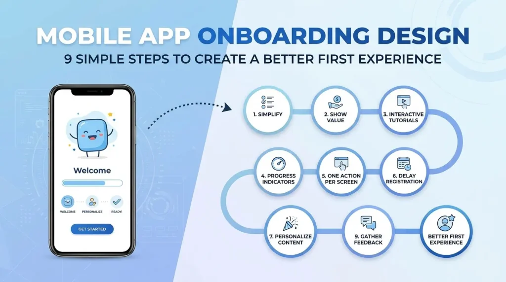
You don’t need dozens of screens or complicated animations to create effective onboarding.
Start with the basics and build from there.
1. Start With the User’s Goal
Before designing a single onboarding screen, answer one simple question:
Why did the user download this app?
This question should influence almost every onboarding decision.
If users downloaded a food delivery app because they want to order dinner, don’t make them watch a five-screen presentation about every feature.
Help them find food.
If they downloaded a budgeting app because they want to understand where their money is going, help them connect their accounts or create their first budget.
The best onboarding experience moves users toward their goal instead of getting in their way.
Ask these questions first:
- Who is the user?
- What problem are they trying to solve?
- What do they need to do first?
- What information is essential?
- What can wait until later?
- What action represents successful activation?
These answers give you the foundation for your onboarding flow.
2. Define the “Aha!” Moment
Every successful app has a moment when users understand its value.
This is often called the aha moment.
For example:
- A language-learning app: completing the first lesson
- A photo-editing app: editing the first image
- A finance app: seeing spending insights
- A social app: finding relevant people to follow
- A productivity app: creating the first task
Your onboarding should guide users toward that moment as quickly as possible.
This is one of the most important principles in mobile app onboarding design.
Instead of asking:
“What features should we explain?”
Ask:
“What does the user need to experience to understand why this app is useful?”
That’s a much better starting point.
3. Keep the First Experience Simple
One of the biggest onboarding mistakes is trying to explain everything at once.
Your app may have dozens of features, but new users don’t need to know about all of them immediately.
A useful rule is:
Introduce what’s necessary now. Introduce the rest when it becomes relevant.
For example, if you’re designing a note-taking app, you probably don’t need to explain advanced sharing, folders, templates, tags, reminders, and integrations before the user creates their first note.
Let users discover advanced features naturally.
Good onboarding reduces the learning curve.
It shouldn’t become the learning curve.
4. Choose the Right Onboarding Type
Not every app needs the same onboarding pattern.
There are several approaches you can use.
Welcome Onboarding
A few introductory screens explain the basic value of the app.
This works well when users need some context before getting started.
Progressive Onboarding
Features are introduced as users encounter them.
For example, a tooltip can explain a feature when the user reaches that part of the app.
This keeps the initial experience clean.
Interactive Onboarding
Users learn by actually performing actions.
Instead of saying:
“You can create custom lists.”
You could guide the user through creating their first list.
This approach can be especially effective because people often learn faster by doing.
Personalized Onboarding
The app asks users a few questions and adjusts the experience based on their answers.
For example:
“What are you hoping to achieve?”
- Save money
- Track spending
- Pay off debt
- Build better habits
The app can then customize what the user sees.

5. Design Fewer, Better Screens
There is no magic number of onboarding screens.
Sometimes one screen is enough.
Sometimes an app needs several steps.
The right number depends on how much information the user genuinely needs before they can begin.
If you do use multiple screens, make each one serve a clear purpose.
For example:
Screen 1: Explain the core value
Screen 2: Help the user personalize the experience
Screen 3: Set up the essential feature
Screen 4: Get the user into the product
Notice what isn’t there?
A long list of every feature your app offers.
Keep the focus on getting users started.
6. Write Like a Human
Your onboarding copy doesn’t need to sound like a technical manual.
Avoid phrases like:
“Our innovative platform enables users to optimize their productivity through an advanced ecosystem of integrated features.”
Nobody wants to read that while setting up an app.
Instead, say:
“Plan your day in a few simple steps.”
Or:
“Let’s build your first workout.”
Simple language feels more welcoming.
Good onboarding copy should be:
- Short
- Clear
- Friendly
- Specific
- Action-oriented
Every word should earn its place on the screen.
7. Make the Next Step Obvious
Users shouldn’t have to search for what to do next.
Your primary button should be easy to identify.
Instead of generic labels such as:
Continue
consider more descriptive actions when appropriate:
- Create my account
- Start my first workout
- Build my budget
- Find nearby restaurants
- Create a project
- Explore the app
Specific CTAs tell users what will happen next.
They also make the experience feel more intentional.
8. Don’t Ask for Permissions Too Early
Permission requests are an important part of many apps, but timing matters.
Imagine opening an app for the first time and immediately seeing requests for:
- Notifications
- Location
- Camera
- Microphone
- Contacts
- Photos
Before you’ve even understood what the app does.
That’s overwhelming.
Instead, request permissions when the user understands why the permission is useful.
For example, if the user taps “Find restaurants near me,” that’s a natural moment to explain why location access is needed.
The user understands the context.
This simple change can make permission requests feel much less intrusive.
9. Make Signup Easier
Registration is often one of the biggest barriers in onboarding.
If users can experience the value of your app before creating an account, consider letting them do so.
Depending on your product, you might offer:
- Continue with Google
- Continue with Apple
- Email signup
- Guest access
- Social login
- Sign up later
Don’t ask for information you don’t actually need.
If your app doesn’t need a phone number at the beginning, don’t make users provide one just because the form has a phone-number field.
Every extra field creates friction.
Essential Elements of a Mobile App Onboarding Screen
A simple onboarding screen often contains four key elements:
1. Visual
An illustration, product screenshot, animation, or relevant image.
2. Headline
A short statement explaining the benefit.
3. Supporting Text
A sentence or two providing context.
4. Action
A clear button telling users what to do next.
For example:
Headline:
Plan your day without the stress.
Supporting text:
Create tasks, set priorities, and see what needs your attention.
CTA:
Create My First Task
That’s enough.
You don’t need to fill every pixel with information.
Mobile App Onboarding UX Best Practices
Good mobile onboarding UX is less about decoration and more about reducing friction.
Here are some principles worth keeping in mind.
Give Users a Sense of Progress
If your onboarding has multiple steps, show users where they are.
For example:
Step 2 of 4
Or use a simple progress indicator.
Knowing that there is an end point can make a longer process feel easier.
Let Users Skip Optional Content
If an introductory carousel isn’t essential, give users a way to skip it.
A user who already understands the product shouldn’t be forced through information they don’t need.
Design for One-Handed Use
Remember that people use phones while walking, sitting, commuting, shopping, and doing other things.
Important buttons should be easy to reach and tap.
Avoid tiny controls and crowded layouts.
Make Text Easy to Read
Don’t sacrifice readability for visual style.
Use:
- Clear typography
- Adequate contrast
- Comfortable spacing
- Short paragraphs
- Strong visual hierarchy
Your users shouldn’t need to zoom in or concentrate just to understand an onboarding screen.
Think About Accessibility
Onboarding should work for as many users as possible.
Consider:
- Screen-reader support
- Sufficient color contrast
- Large enough touch targets
- Text scaling
- Captions for video
- Meaningful labels
- Avoiding color as the only way to communicate information
Accessibility isn’t something to add at the end.
It should be part of the design from the beginning.
Common Mobile App Onboarding Mistakes
Even attractive onboarding can fail if it creates unnecessary friction.
Here are some common mistakes to avoid.
Too Much Information
Don’t turn onboarding into a product manual.
Users don’t need to understand every feature before they begin.
Too Many Permission Requests
Ask for permissions when they’re relevant.
Forcing Users Through Tutorials
Give experienced users a way to skip unnecessary explanations.
Complicated Registration
Keep account creation as simple as possible.
Vague Buttons
“Next” doesn’t tell users much.
Use action-focused labels when possible.
Hiding the Main Value
Users should understand why your app is useful quickly.
Ignoring Real User Feedback
Your design team may think an onboarding flow is obvious.
Your users may disagree.
Watch real people use it.
Their behavior will often reveal problems you didn’t notice.
How to Test Your Mobile App Onboarding Design
You don’t need a huge research budget to start testing.
Even a small usability test can reveal major issues.
Give a few people your app and ask them to complete a simple task.
For example:
“You’ve just downloaded this app. Show me how you would create your first project.”
Don’t immediately help them.
Watch what they do.
Pay attention to:
- Where they hesitate
- What they tap first
- What they ignore
- What they misunderstand
- Where they go backward
- Where they ask questions
- Whether they reach the desired outcome
These observations can be more valuable than simply asking:
“Do you like the design?”
You’re trying to discover whether the design works—not whether people think it looks nice.
Measure the Right mobile app Onboarding Metrics
Once your onboarding is live, use data to understand where users are dropping off.
Useful metrics include:
Onboarding Completion Rate
How many users complete the onboarding process?
Activation Rate
How many users reach the key action that demonstrates product value?
Drop-Off Rate
Where are users leaving?
Time to Value
How long does it take users to experience the main benefit?
Retention
Do users who complete onboarding come back?
Conversion Rate
How many users move from onboarding into the desired product action?
Analytics can show you where the problem is, but they don’t always explain why it’s happening.
That’s why quantitative data and usability testing work well together. Mobile App Onboarding
A Simple Mobile App Onboarding Design Process
If you’re starting from scratch, use this process.
Step 1: Understand Your Users
Identify who you’re designing for and what they want to accomplish.
Step 2: Define the Core Value
Write down the one thing users need to understand first.
Step 3: Identify the Aha Moment
Determine the action that demonstrates your product’s value.
Step 4: Map the User Journey
Sketch the steps a new user needs to take to reach that moment.
Step 5: Remove Unnecessary Steps
Look for anything that doesn’t directly help the user.
Step 6: Create Wireframes
Start with simple layouts before worrying about colors and animations.
Step 7: Write the Copy
Use clear, conversational language.
Step 8: Build the Visual Design
Add typography, illustrations, product screenshots, buttons, and other UI elements.
Step 9: Test With Real Users
Watch people use the onboarding flow.
Step 10: Measure and Improve
Use analytics and feedback to identify opportunities for improvement.
This process keeps the focus on the user rather than the decoration. Mobile App Onboarding
Mobile App Onboarding Design Example
Imagine you’re creating a meditation app.
A complicated onboarding flow might look like this:
Welcome → Feature tour → Company story → Benefits → Account creation → Notifications → Location → Preferences → Subscription → Home screen
That’s a lot before the user gets to meditate.
A simpler experience could be:
Welcome → Choose your goal → Select session length → Start first meditation
The second approach gets the user to the product’s value much faster.
Later, you can introduce advanced features such as reminders, personalized recommendations, progress tracking, and subscription options.
That’s the difference between explaining the product and helping someone use the product. Mobile App Onboarding
Should You Use Animations in mobile App Onboarding?
Animations can make onboarding feel more engaging, but they should have a purpose.
Good animation can:
- Explain an interaction
- Show how a feature works
- Direct attention
- Make transitions feel natural
- Provide feedback
But animation shouldn’t slow users down.Mobile App Onboarding
If a user has to wait five seconds for an animation before they can continue, the visual effect may be doing more harm than good.
Use motion to improve understanding—not simply because it looks impressive.
The Future of Mobile App Onboarding
Modern onboarding is moving away from long introductory tutorials and toward more contextual experiences.
Instead of explaining every feature upfront, apps can introduce functionality when users actually need it.
This approach makes onboarding feel more natural.
For example, instead of explaining a search filter during a five-screen tutorial, the app can introduce the filter when the user performs a search.
Instead of explaining collaboration before the user creates anything, the app can introduce sharing when they are ready to share their first project.Mobile App Onboarding
This is often called progressive onboarding, and it reflects a simple idea:
Don’t teach users what they don’t need yet.
Final Thoughts about Mobile App Onboarding
Great mobile app onboarding design isn’t about creating the most impressive welcome screen.
It’s about helping someone become comfortable with your product as quickly and naturally as possible.
Start by understanding what your users want. Identify the moment when they first experience your product’s value, then build the onboarding experience around reaching that moment.
Keep the number of steps under control. Use simple language. Make buttons obvious. Ask for permissions at the right time. Avoid unnecessary forms. Test the experience with real users and use data to improve it.
Most importantly, remember that onboarding isn’t separate from your product experience.
For a new user, mobile app onboarding is the product experience.
If the first few minutes feel clear, useful, and welcoming, users have a much better reason to continue.
And that’s ultimately what good onboarding should accomplish: help people understand your app, experience its value, and feel confident using it.
Frequently Asked Questions
What is mobile app onboarding design?
Mobile app onboarding design is the process of creating the first-use experience that helps new users understand an app, complete important setup steps, and reach the product’s core value.
How many onboarding screens should a mobile app have?
There is no universal number. Use as few screens as possible while still providing the information users genuinely need. If a screen doesn’t help users move toward their goal, consider removing it.
What makes good mobile app onboarding?
Good onboarding is simple, relevant, easy to navigate, and focused on helping users reach a meaningful outcome. Clear copy, intuitive navigation, appropriate personalization, and well-timed permission requests are all important.
Should users be able to skip mobile app onboarding?
If the onboarding content isn’t essential, giving users a skip option can improve the experience. However, critical setup steps may still need to be completed.
When should an app ask for permissions?
Ask for permissions when the user understands why they are needed. Contextual permission requests are generally less confusing than asking for several permissions immediately after installation.
How can I improve my mobile app onboarding?
Start by identifying where users drop off. Combine analytics with usability testing to understand the problem, then simplify confusing steps, improve copy, reduce friction, and test the changes.
What is progressive onboarding?
Progressive onboarding introduces features and guidance gradually as users encounter them instead of explaining everything during the first launch.
Why is mobile app onboarding important?
A strong onboarding experience helps users understand an app, reach its core value faster, and become comfortable using it. A confusing onboarding experience can cause users to leave before they discover the product’s benefits.