
Subtotal ₨ 0
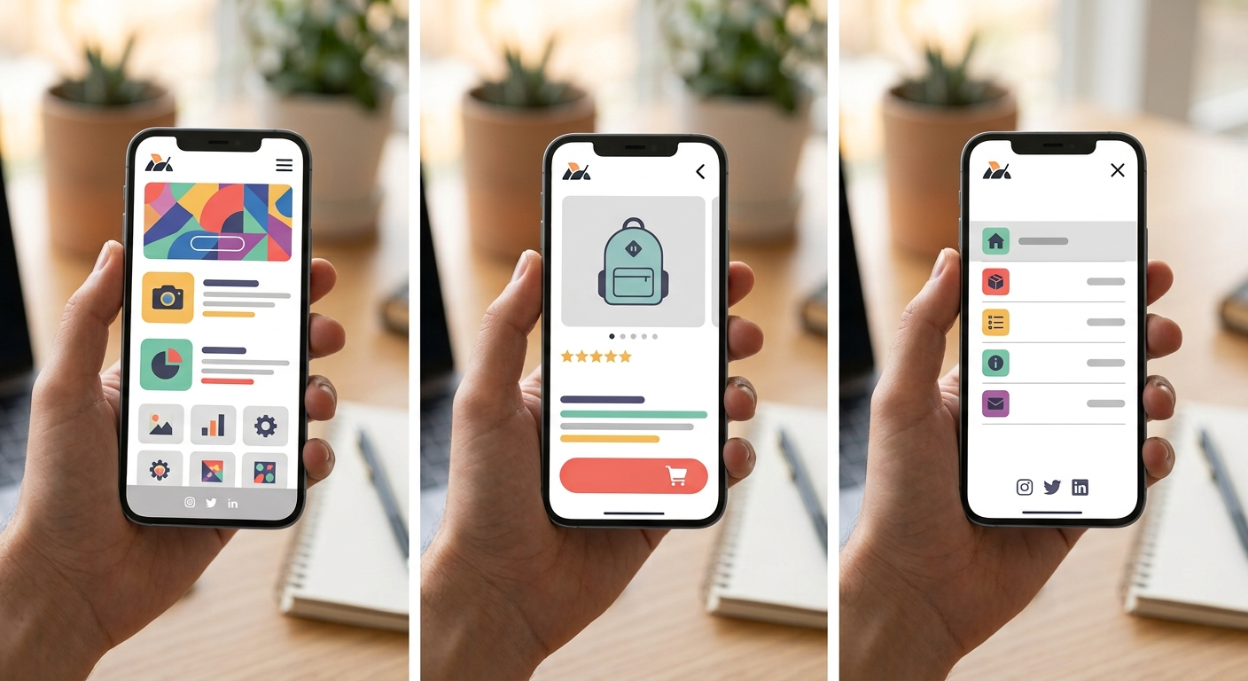
More visitors browse on a phone than a desktop for most businesses today, which is exactly why mobile-first web design has become the standard approach rather than an afterthought. This practical guide explains what mobile-first really means, walks through mobile website design best practices, and shows you how to make a website mobile friendly from the very first wireframe.
Table of Contents
- What Is Mobile-First Web Design?
- Why Website Design for Mobile Devices Matters
- 10 Mobile Web Design Best Practices
- How to Make a Website Mobile Friendly: Quick Checklist
- Common Mobile Design Mistakes
- Final Thoughts
- Frequently Asked Questions
What Is Mobile-First Web Design?
Mobile-first web design means designing for the smallest screen first, then expanding the layout for tablets and desktops, rather than shrinking a desktop design down to fit a phone. This approach forces every decision to focus on what matters most, since there is far less space to work with.
Why Website Design for Mobile Devices Matters
Google uses the mobile version of your site for indexing and ranking through mobile-first indexing, so a site built around mobile website design best practices has a real SEO advantage. Beyond rankings, a smooth mobile experience directly affects how long visitors stay, how easily they can complete key actions, and whether they come back.
10 Mobile Web Design Best Practices
These are the core techniques behind strong mobile-first web design, in order of impact.
1. Design for Touch, Not a Mouse
Buttons and links need enough space for a thumb, generally at least 44 to 48 pixels, with enough spacing so visitors do not tap the wrong element by mistake.
2. Use a Single-Column Layout
Stacking content in one clear column is far easier to read and scroll through on a small screen than a complex multi-column layout borrowed from desktop.
3. Keep Navigation Simple
A collapsible menu, often called a hamburger menu, keeps navigation out of the way until visitors need it, preserving valuable screen space for content.
4. Prioritize Your Most Important Content
Mobile screens force hard choices. Lead with what matters most to visitors, and push secondary content further down the page.
5. Optimize Images for Mobile
Compress images, use responsive sizing with the srcset attribute, and lazy load anything below the fold to keep pages fast on mobile connections.
6. Use Readable Font Sizes
Keep body text at 16 pixels or larger, since smaller text forces visitors to zoom in, which creates a frustrating experience on a small screen.
7. Add the Viewport Meta Tag
Without it, mobile browsers may render a zoomed-out desktop view instead of a true mobile layout. This small line of code is essential to any website design for mobile devices.
8. Make Forms Mobile Friendly
Use large input fields, appropriate keyboard types, such as a number pad for phone fields, and keep forms as short as possible on mobile.
9. Test Loading Speed on Mobile Networks
Mobile connections are often slower than home wifi. Test your site’s speed specifically under mobile conditions using Google PageSpeed Insights.
10. Test on Real Devices
Browser emulators are useful, but testing on real phones and tablets catches issues that simulators sometimes miss, especially around touch targets and scrolling.
How to Make a Website Mobile Friendly: Quick Checklist
Run through this list to confirm your site covers the basics:
- Viewport meta tag is present
- Layout works at common phone and tablet widths
- Buttons and links are easy to tap
- Text is readable without zooming
- Images are compressed and properly sized
- Forms are short and easy to complete on a small screen
Common Mobile Design Mistakes
Even with mobile-first web design in mind, these issues slip through often.
Avoid these frequent issues that hurt the mobile experience:
- Hiding important content on mobile to save space
- Tiny buttons or links placed too close together
- Pop-ups that are hard to close on a small screen
- Forgetting the viewport meta tag entirely
- Testing only on one device or browser
Final Thoughts
Treating mobile-first web design as the default, not an afterthought, is no longer optional for most businesses. Apply these mobile website design best practices, keep your layout simple and fast, and test regularly on real devices so your site works well for the majority of visitors who arrive on a phone.
At System Software Development Solution (SSD Sol), our team in Lahore builds fast, mobile-first websites for businesses of every size. Explore our web development services, learn more about us, or read our guide on top web development trends. Need a mobile-friendly redesign? Contact us for a free consultation.
Frequently Asked Questions
What is mobile-first web design?
It is an approach where you design for the smallest screen first, then expand the layout for tablets and desktops, rather than shrinking a desktop design down.
How to make a website mobile friendly quickly?
Start with the viewport meta tag, a single-column layout, readable text, and compressed images. These changes give the biggest improvement for the least effort.
Is mobile website design different from responsive design?
They are closely related. Responsive design is the technique that makes a layout adapt to any screen, while mobile-first web design is the strategy of designing for mobile before desktop.
Does mobile-friendly design affect SEO?
Yes. Google uses mobile-first indexing, meaning the mobile version of your site is what gets indexed and ranked, so website design for mobile devices directly affects search visibility.