
Subtotal ₨ 0
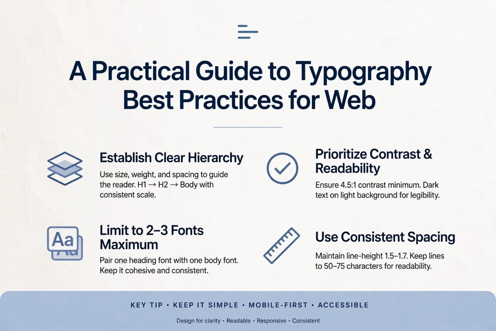
Typography best practices for web are essential for creating readable, accessible, and visually appealing digital experiences. When designers understand typography best practices for web, they can improve user engagement, reduce bounce rates, and enhance overall usability.
Why Typography Best Practices for Web Matter
Typography shapes how users read, understand, and interact with content. Good typography improves clarity, while poor typography creates frustration. On the web, users skim more than they read, so your text must be optimized for quick scanning.
Typography best practices for web ensure your content is readable on all screen sizes, from desktops to mobile devices.
By following responsive text design and simple web typography tips, you can make your content easier to read.
Responsive Typography for Mobile Devices
Mobile users make up the majority of web traffic today. Typography best practices for web must adapt to smaller screens. Designers should use relative units like em or rem instead of fixed pixels, ensuring text scales properly. Responsive typography also means adjusting line height and spacing for readability on mobile. A heading that looks perfect on desktop may overwhelm a phone screen, so testing across devices is essential.
Accessibility in Web Typography
Accessibility is more than a design trend — it’s a requirement. Typography best practices for web include ensuring text is readable for users with visual impairments. This means maintaining high contrast between text and background, avoiding very thin fonts, and providing scalable text options. Designers should also avoid long blocks of all‑caps text, which are harder to read. By following accessibility guidelines, you make your site usable for everyone.
Key Principles of Typography Best Practices for Web
Choose Readable, Web‑Safe Fonts
Readable fonts are the foundation of good typography. Sans‑serif fonts like Inter, Roboto, and Open Sans perform well on screens. They offer clean shapes, consistent spacing, and excellent legibility.
Avoid overly decorative fonts for body text. Use them only for headings or highlights.
Maintain Proper Font Size Hierarchy
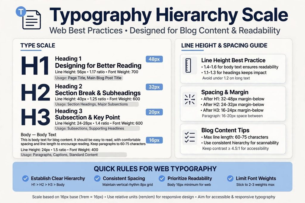
Hierarchy guides the reader’s eye. Headings should be noticeably larger than body text. A common structure is:
- H1: 32–40px
- H2: 24–30px
- H3: 18–22px
- Body: 16–18px
Typography font hierarchy web emphasize consistency across all pages.
Use Adequate Line Height and Spacing
Line height improves readability. A good rule is:
- Body text: 1.5–1.7 line height
- Headings: 1.2–1.4 line height
Spacing between paragraphs should be slightly larger than spacing between lines.
Applying Typography Best Practices for Web in Real Projects
Contrast and Color
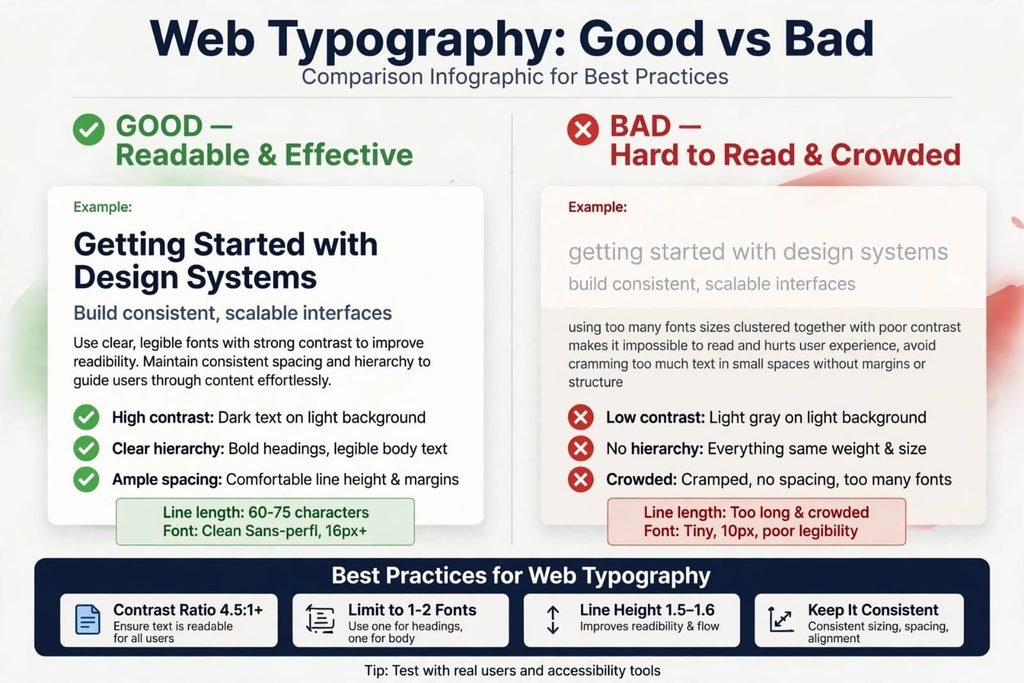
Contrast ensures text is readable. Dark text on a light background is the safest choice. Avoid low‑contrast combinations like gray on white.
Limit the Number of Fonts
Using too many fonts creates visual noise. Stick to:
- 1 font family for body
- 1 complementary font for headings
Typography best practices for web recommend no more than two fonts per project.
Responsive Web Typography
Text must scale smoothly across devices. Use relative units like rem instead of px. This ensures accessibility and consistency.
Common Mistakes to Avoid in Typography Best Practices for Web
Overusing Bold and Italics
Bold and italics should highlight important points, not entire paragraphs.
Poor Alignment
Left‑aligned text is best for readability. Avoid center‑aligned body text.
Ignoring Accessibility
Typography best practices for web include accessibility rules:
- Minimum 16px body text
- High contrast
- Avoid all‑caps paragraphs
- Ensure readable spacing
Inconsistent Font Usage
Using too many different fonts across a website creates visual clutter and confuses readers. Typography best practices for web recommend sticking to one or two font families to maintain consistency and professionalism.
Neglecting White Space
Crowded text blocks make reading difficult. Proper white space around headings, paragraphs, and images improves readability and gives the design a clean, modern look. Balanced spacing is a key part of typography best practices for web.
Conclusion — Master Typography Best Practices for Web
Typography best practices for web help you create clean, readable, and professional digital experiences. When you apply these principles consistently, your website becomes more user‑friendly and visually appealing.
To improve your website design further, explore more UI/UX Design solutions at SSD Solutions. Visit our contact page to get expert help.